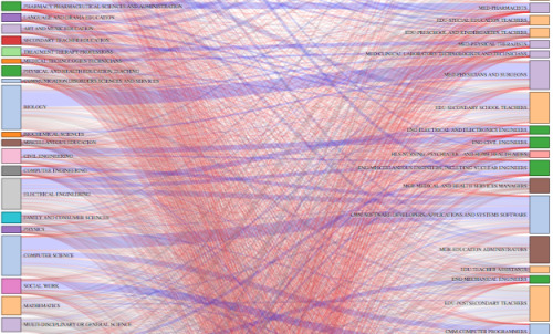
Ben Schmidt, an assistant professor of history at Northeastern University, was curious about careers after college degrees, so he used a quick Sankey diagram to look at data from the American Community Survey. College degrees are on the left, and professions are on the right. The thicker a line that connects a degree and a profession, the more people tend to go a certain route.